UI/UX Design Trends Worth Adopting in 2026 (and Ones to Skip)
Glassmorphism is back, AI-generated layouts are everywhere, and everyone has an opinion on spatial UI. We separate what actually improves conversion from what's just noise.
Design Twitter moves fast, and every year brings a new visual language that's supposedly going to replace everything that came before it. Most of it is aesthetic noise. Some of it genuinely changes how people use products. After redesigning checkout flows, dashboards, and mobile apps for well over a hundred clients, here's where we land on the trends actually worth your engineering time in 2026.
Worth adopting: adaptive information density
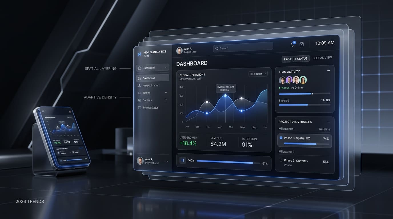
Instead of one fixed layout, interfaces that quietly adjust density based on user expertise — collapsing advanced controls for new users, surfacing them for power users — are consistently winning in usability testing. We used this pattern on the FoRID Foundation Platform rebuild, where grassroots volunteers saw a simplified program tracker while researchers and directors accessed rich analytical archives. Engagement across both cohorts rose dramatically.
Worth adopting: motion with a purpose budget
Micro-interactions aren't dead, but the 'animate everything' era is. The teams getting real value from motion design now set a strict purpose budget: an animation only ships if it communicates state change, guides attention, or confirms an action. Everything else is cut in review, because unnecessary motion is one of the most common causes of perceived sluggishness on mobile.
Skip: AI-generated layouts as a finished product
AI tools are excellent at generating starting points — mood boards, layout variations, copy drafts. They are not yet good at understanding your actual users, your brand constraints, or your data. We use generative tools constantly in early exploration, then hand every surviving concept to a human-led usability pass. Shipping raw AI output to production is the fastest way to ship an interface nobody asked for.
Skip: heavy glassmorphism on data-dense screens
Frosted-glass panels look premium in a hero section and become a legibility problem the moment you put a data table or a form behind them. Reserve translucency effects for marketing surfaces; keep dashboards and checkout flows on solid, high-contrast surfaces where accessibility and conversion actually get measured.
- Use glass effects on hero sections, not data tables
- Cap animation to state-change and confirmation moments
- Let layouts adapt to user expertise, not just screen size
- Treat AI-generated concepts as a first draft, never a final one
The through-line
Every trend worth adopting this year has one thing in common: it reduces cognitive load instead of adding visual flourish. If a pattern makes the interface prettier but the task slower, it's not a trend worth shipping — no matter how it performs in a design portfolio.